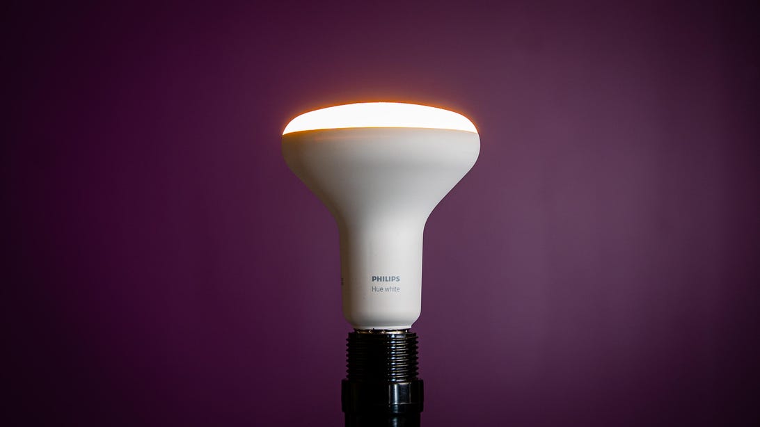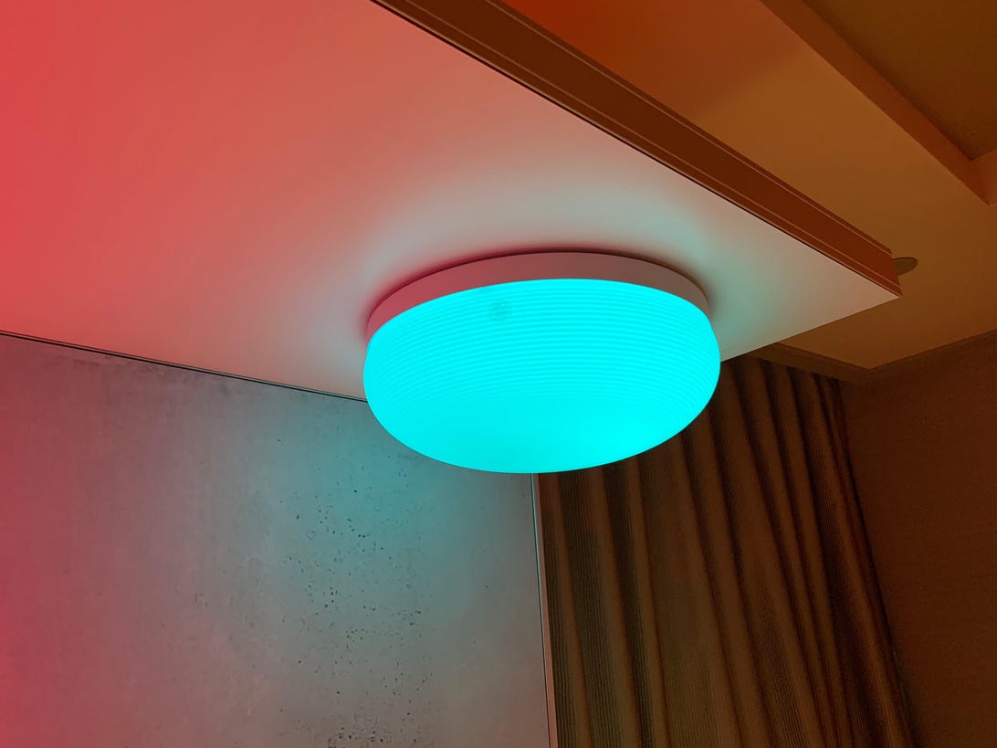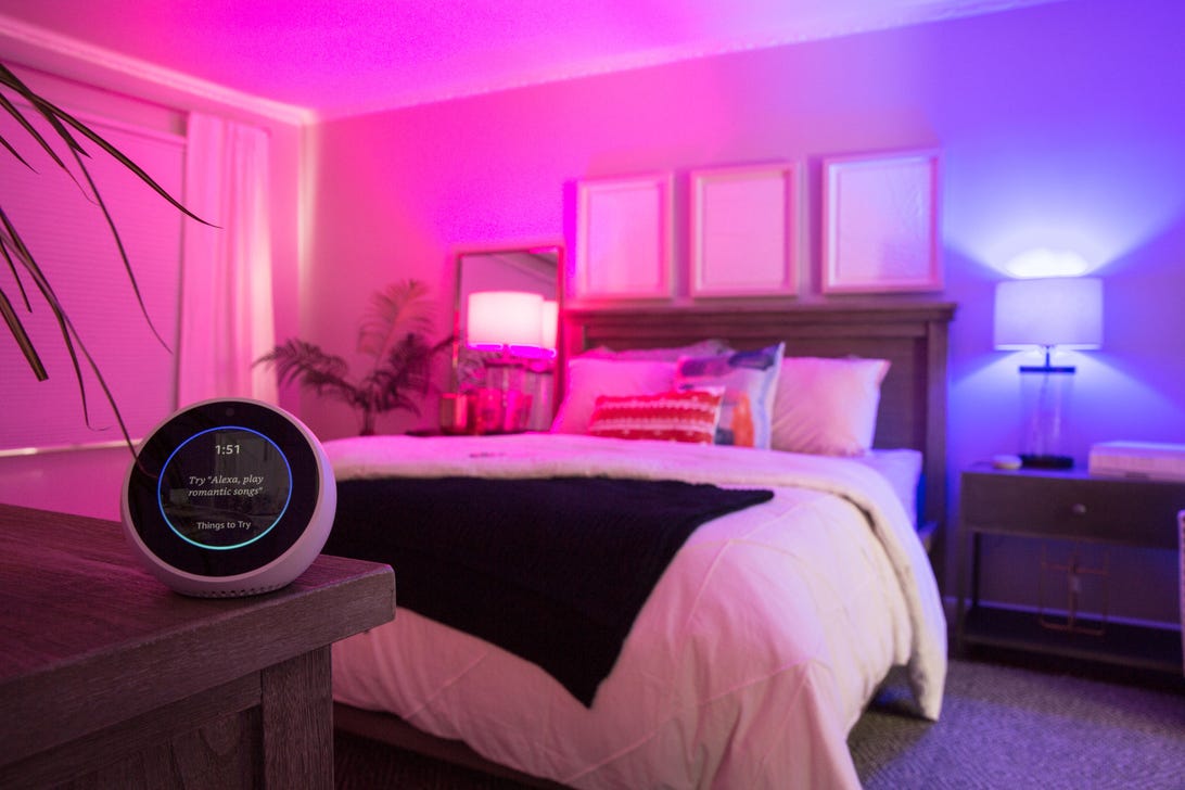
Philips Hue's parent company Signify announced a totally redesigned app for controlling its smart lights today.
Chris Monroe/CNETSmart home lighting maker Philips Hue is launching a major redesign of its popular mobile app, parent company Signify announced today, with the update set to roll out globally over the next week. And while the announcement is rife with all the typical marketing hoopla about improved performance, more intuitive controls and streamlined automations, after testing a preview version of the app for the last week, I can say with some authority that it's not entirely hyperbole.
And let me tell you, I put this app through the ringer. Most people I know might pepper their homes with a few smart lights here and there, I manage a veritable menagerie of Philips Hue devices in mine. At last count, I was running 14 color bulbs, six white ambiance lights, two white ambiance floodlights and one boring old white bulb that's stuck on the same slightly warm color temperature.
Yet despite such an unwieldy collection of smart lights, figuring out how to navigate the graphically more intense controls was actually pretty easy and, dare I say, intuitive. The new Hue app retains most if not all of the same functions as the previous version -- it just shuffles them around and groups them together a bit differently, while adding more color cues that let you know which bulbs are set to what color and brightness settings.

The new Hue app offers more streamlined controls that let you rename lights or rearrange them within rooms or zones without having to delve into the Settings menu.
Chris Monroe/CNETHowever, rather than confusing matters, the relocated controls are actually easier to find now that they've been put where (to be honest) they really ought of gone in the first place. That includes all the places where redundancy has been added.
For example, previously, to swap around lights within various rooms and zones, you'd have to delve deep into the app's settings menu, where you'd then have to rely on your imagination, since everything was plain text with no visual elements to help guide you. If you wanted to rename a light and move it to a different room, you'd have to plunge into two different submenus – one for lights and one for rooms and zones – to get it done.
With the updated app, you can configure lights, rooms and zones no matter where you are within the Home tab by taping the "more" menu (the circle containing three dots) at the top of the screen. Easy peasy.

In the updated Philips Hue app, routines have been renamed automations.
Ry Crist/CNETEven more impressive, however, is that despite all this reorganizing, only one feature seems to have been shoved into something of a random corner. For whatever reason, the tab for Philips Hue Labs (which I doubt more than a few dozen people other than me actually use anyway) is now buried under automations. If you've yet to craft any automations, you'll have to tap the more menu button at the top to even see the Hue Labs option (otherwise, once you have at least one automation, it appears at the bottom of the screen).
In terms of performance, the app really does seem to just work better than previous versions. Controls and their associated animations seem snappier. Automations (formerly known as routines) do what you think they're going to do, and they do it quickly and consistently, to the point you stop consciously noticing them at all.
But personally, my favorite improvement is how much better the updated app is at crafting scenes – those unique, multi-color light arrangements the app generates from a photograph, which can be pulled either from the prepopulated Hue scene gallery or your phone's own camera roll. Scenes turned out much better, with more complex and visually appealing combinations of colors compared to the old version of the app.

Multi-light, multi-color scenes created with the new app seem more complex and visually appealing than in previous versions.
Josh Miller/CNETIn a new feature called Dynamic Scenes that isn't that slated to arrive until later this summer, rather than remain one single, static color, lights will slowly change over time. Dynamic Scenes sounds strikingly similar to an experimental feature that's been available in Hue Labs for a while now, called Living Scenes, but we'll have to wait until its released to know for sure.
In the meantime, the updated Philips Hue app should be available in both the Apple App Store and Google Play store starting today, so if you're too impatient to wait for the app to update automatically, go grab it now. When you open the new app for the first time, you'll be guided through a migration process that will (hopefully) retain all of your previous settings, scenes and routines (which will now be listed under the Automations tab).
"smart" - Google News
June 03, 2021 at 02:44PM
https://ift.tt/3ceXq5g
Philips Hue launches redesigned smart light app. Here's how to find all the new features - CNET
"smart" - Google News
https://ift.tt/2P2kUhG
https://ift.tt/3febf3M
Bagikan Berita Ini


0 Response to "Philips Hue launches redesigned smart light app. Here's how to find all the new features - CNET"
Post a Comment